|
require(ggplot2)
require(scales) Require(lubridate) #POSIX is used to deal with date-time format data welldata$DATE= as.character(welldata$DATE) welldata$DATE=as.POSIXct(welldata$DATE, format="%Y-%m-%d %H:%M") ggplot(welldata, aes(x = welldata$DATE)) + geom_line(aes(y = welldata$B1, colour="red")) + geom_line(aes(y = welldata$B2, colour = "blue")) + geom_line(aes(y = welldata$A, colour = "green"))+ ylab(label="Head (m)")+ xlab(label="")+ labs(title="")+ #scales package allows for easier defining of time axes scale_x_datetime(breaks = date_breaks("1 year"), labels = date_format("%Y"))+ scale_color_discrete(name="", labels= c("B1","A","B2"))+ theme_light()+ theme(axis.text.x = element_text(angle = 90, hjust = 1)) |
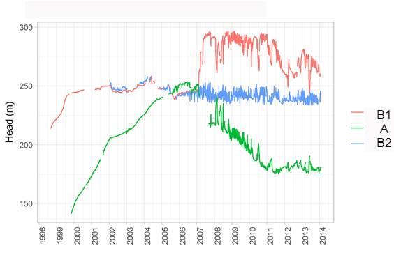
Hourly water level measurements
|
|
require(ggplot2)
require(zoo) require(ggfortify) require(scales) B2zoo=zoo(welldata$B2, welldata$DATE) B1zoo=zoo(welldata$B1, welldata$DATE) Azoo=zoo(welldata$A, welldata$DATE) #na.approx fills NAs by linear interpolation fillB2zoo= na.approx(B2zoo) fillAzoo= na.approx(Azoo) fillB1zoo= na.approx(B1zoo) #aggregates hourly data to daily data B1daily= aggregate(fillB1zoo,as.Date,mean) B2daily= aggregate(fillB2zoo,as.Date,mean) Adaily= aggregate(fillAzoo,as.Date,mean) #ggfortify transforms zoo into df in order to be used by ggplot ggplot(aes(x =Index, y=Value, colour="red"),data= fortify(B2daily, melt=TRUE))+ geom_line() + geom_line(aes(x = Index, y = B1daily, colour="blue"), data = fortify(B1daily))+ geom_line(aes(x = Index, y = Adaily, colour="green"), data = fortify(Adaily))+ ylab(label="Head (m)")+ xlab(label="")+ labs(title="")+ #scales package for x axis scale_x_date(breaks = date_breaks("1 year"), labels = date_format("%Y"))+ scale_color_discrete(name="", labels=c("B1","A","B2"))+ theme_light()+ theme(axis.text.x = element_text(angle = 90, hjust = 1)) |
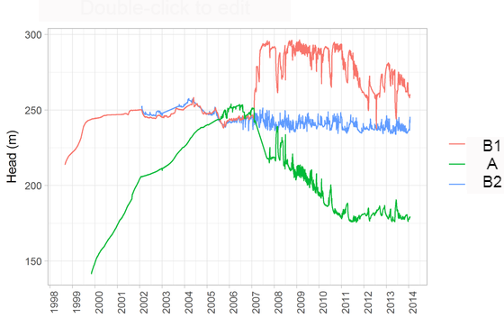
Hourly water level measurements aggregated to daily data with data gaps filled
|
|
Require(ggplot2)
Require(cowplot) Require(scales) #*Fancy_scientific* a function created by Brian Diggs that displays scientific notation on plots without using E https://groups.google.com/forum/#!topic/ggplot2/a_xhMoQyxZ4 pump=read.csv("") pump$date=as.Date(pump$date,"%m/%d/%Y") bar=ggplot(pump, aes(date, volume)) + geom_bar(stat="identity") + xlab("") + ylab(expression(paste("Volume "(m^3/month))))+ labs(title="")+ theme_bw()+ scale_x_date(labels =date_format("%b-%Y"), date_breaks = "1 year",date_minor_breaks="1 month")+ scale_y_continuous(labels=fancy_scientific)+ theme(axis.text.x = element_text(angle = 50, hjust = 1))+ theme(panel.grid.major.x=element_line(colour="black")) line=ggplot(pump, aes(date, head)) + geom_line(size=1) + xlab("") + ylab(expression(paste("Head "(m))))+ labs(title= "")+ theme_bw()+ scale_x_date(labels =NULL,date_breaks = "1 year",date_minor_breaks="1 month")+ theme(axis.text.x = element_text(angle = 50, hjust = 1))+ theme(panel.grid.major.x=element_line(colour="black")) #plot_grid is from cowplot package which creates trellis plots with ggplot2 objects linebar=plot_grid(line, bar, labels = NULL, ncol = 1, align = 'v') linebar |
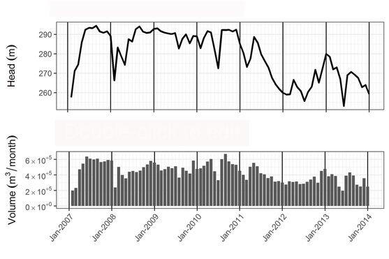
Trellis plot of monthly water levels and pump volumes
|
